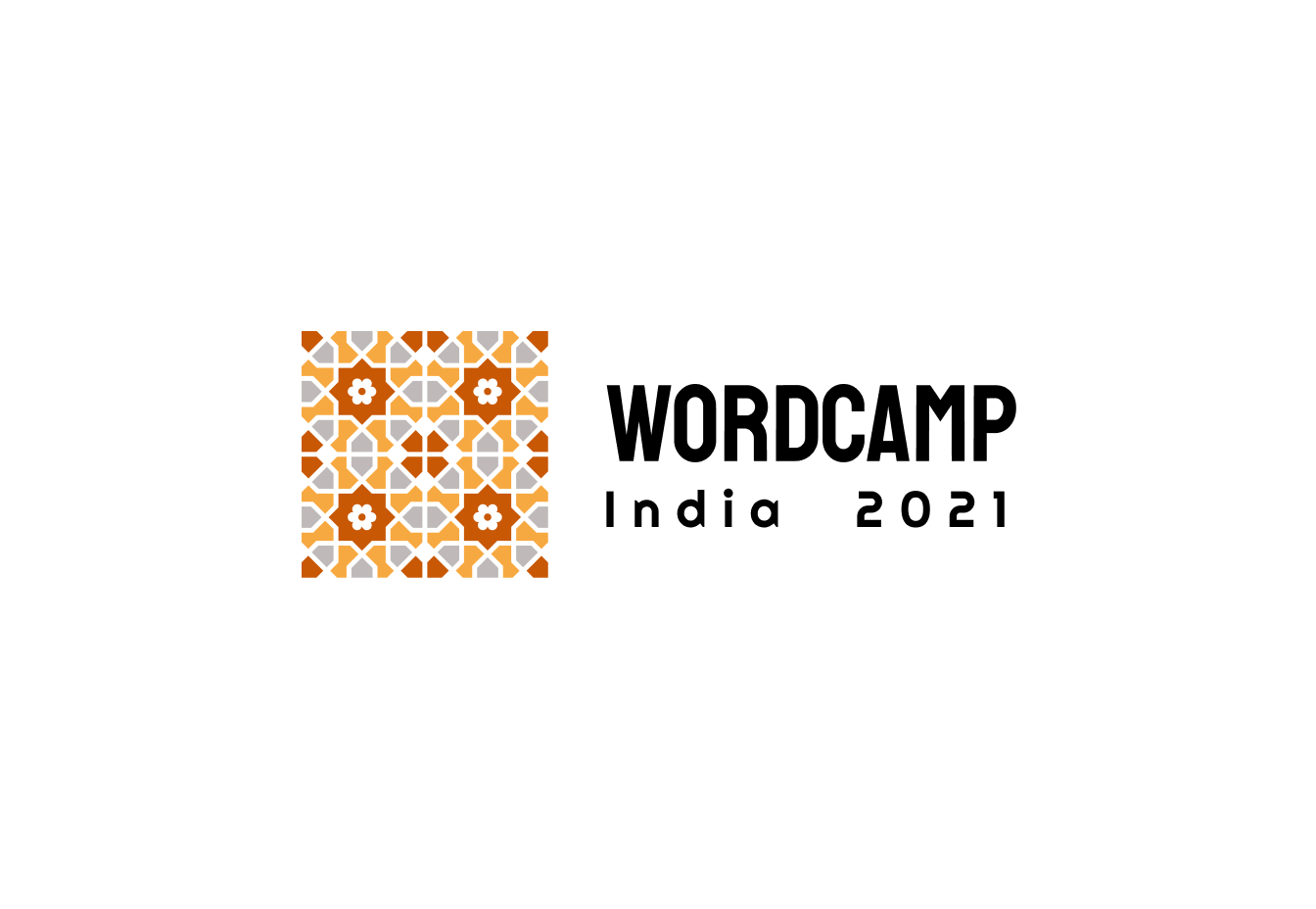
The design team for WordCamp India 2021 has been on an interesting journey to come up with the logo and design.
The design team of Ganesh Kerkar, Arvind Baraskar, Vachan Kudmule and myself took inspiration from WordCamp Asia’s blog post on writing down details on how something like this evolves.
Please note: Most of our earlier logos have the text WordCamp India 2020 – these designs were created at an earlier stage of event planning when we were thinking of hosting the event in December 2020. The event has since moved to January-February 2021.
Explorations
In our initial call we agreed on the directions we are exploring the logo:
- The Indian pattern design. It can be some elements from the design on monuments as the Taj Mahal, or Paisley art or adding elements of Lotus, etc to give the logo a more Indian feel
- Make a logo in nice typography. Taking inspiration from Indian Typography style from Street Art or Horn Ok etc
- Taking inspiration from Indian symbolic elements such as Namaste, Tika, etc
- Taking inspiration from Indian monuments etc
We explored how other WordCamps have presented the logo. We also explored how other bands are expressing India.
Here are some of the initial logo concepts:


These are just some of the logo forms we explored initially. We then started to explore and play with patterns that are common through India
What represents India?
It is very tough to represent a diverse country like India, in the form of symbol or logo. We didn’t want our logo to be presenting a religion, a language, or a part of the country. In our mind, the logo had to be symbolic and very abstract, in a way that brings out the essence of India.
We also interviewed some of our foreign friends on how they see India, and what they think represents India. It was really useful in our journey, and we got great insights from different perspectives. We also got some ideas on what colours represent India too.
How WordCamp Europe did it
The organizers of WordCamp Europe wrote a lovely post on how they came up with their logo concept. It was inspiring and gave the direction to our design journey.
We loved how they took inspiration from Portuguese Azulejos tiles and how it reflected on their logo.

We have more patterns in India
Inspired by WordCamp Europe, we decided to dig deeper into the symbols and patterns that represent India. We explored many famous monuments, but were awestruck with the kind of detailed work done on the Taj Mahal, without doubt, one of the wonders of the world.

That inspired us to kick-off a Google Search for images on patterns, and this is what we found:

Too many details, we want something simple!
We loved how these patterns were turning out. Ganesh Kerkar came up with a lot of concepts on simplifying these details to build something minimalistic. After several hours of research, we zeroed in on something clean and nice!


Our quest for a minimal logo with patterns that represent the diversity emanating the length and breadth of India, was ready to be showcased! 🎉
Typography
Our next challenge was to select good typography to represent WordCamp India. And for that, we had to choose the perfect font. The first font that came in my mind was Poppins by Indian Type Foundry. It is Indian and has Indian glyphs too, so it can be used on multilingual platforms as well

.

However, the initial set of results did not match our expectations.


Determined, we decided to play around a little more, with different colours, this time.


The Final logo
After quite a bit of soul-searching and research, we zeroed in on our final logo, which we are happy to unveil for you!


Our final logo for WordCamp India is clean and modern. It is an abstract way of representing India. The colours are earthy. It is modular. The blocks with different patterns join together to make our logo surprisingly similar to the Gutenberg logo. 😉
What are your thoughts on the WordCamp India logo? Do you like it? Do you have any thoughts on the event, or are you generally excited about WordCamp India? Do share your thoughts in the comments!
Also, watch this space. We have several exciting updates coming soon! 🔥


I love this! Reading about the evolution of the logo is so interesting. Thank you for sharing that!